Why everything looks AI-generated
In the next five minutes you will be able to look at any AI-generated page and name exactly why it looks AI-generated — the vocabulary the whole course runs on.
Drag the slider. Same product, same copy, same one-sentence brief. The only difference is one line in the prompt — which is the entire subject of this course.
 BeforeAfter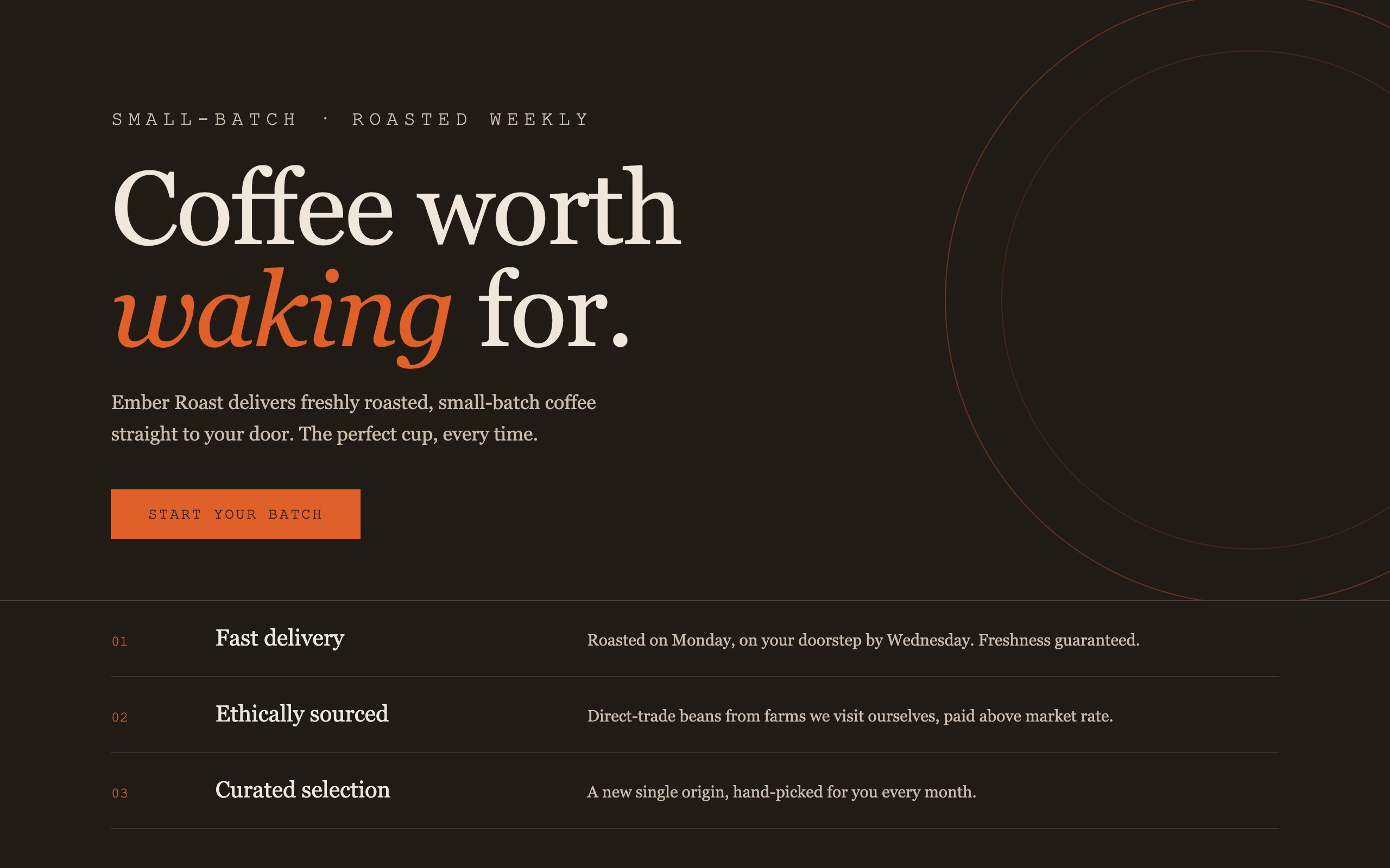
The left page is not broken. It is centered, legible, responsive, and completely forgettable. You have seen it a thousand times — and that is the point: you literally have.
Where the sameness comes from
Claude has read millions of web pages. Ask it for "a landing page" with no further direction and it does the statistically safest thing: it reproduces the average of everything it has seen. Anthropic's own engineers have a name for this — distributional convergence — the model converging on the middle of its training distribution.
The middle of that distribution is very specific. Check the left screenshot against this list:
- A purple-to-blue gradient hero. Nobody chose purple; purple is what "no choice" looks like.
- System or Inter type, one size scale, no personality anywhere in the letterforms.
- Everything centered, in a narrow column, with even spacing between identical sections.
- Three feature cards in a row, each with an emoji where an idea should be.
- Rounded corners on everything, a soft shadow on everything, an arrow after the button text.
None of these are mistakes. Each one is the most common answer to a question you did not ask. A designer would say the page has no point of view — nothing on it is evidence that anyone made a decision.
The tells are moving
Here is the part most "AI design" advice gets wrong: the slop list above is already the old list. Enough people banned purple gradients that a second generation of defaults appeared. Anthropic's frontend-design skill — the instructions Anthropic itself wrote to fight this, and worth reading in full — names three looks that AI output now clusters into:
practice
Open Claude Cowork on your own computer and try this on real files. Each module ends with a checkpoint where you submit what you made.
Open in ClaudeNext
The four levers of a design