The four levers of a design
In the next five minutes you will know the four levers that turn a generic page into a designed one — and you will have pulled one of them yourself, on your own artifact.
Anthropic's own guidance for getting better-looking output from Claude — the docs, the cookbook, the frontend-design skill — keeps returning to the same four dimensions. Learn to see them separately and you can diagnose any page in under a minute.
Here is the same flat, competent, undirected page with one lever pulled at a time. Nothing else changes between the two sides of each slider.
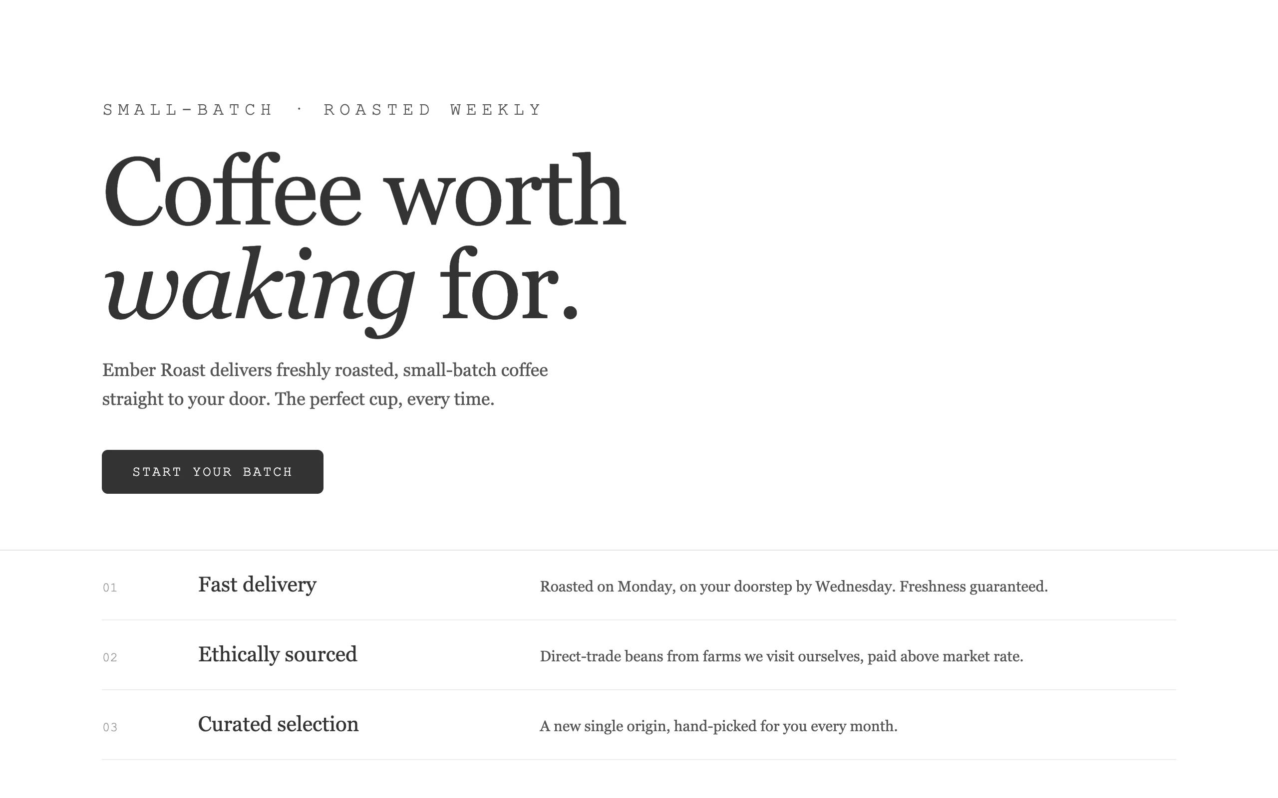
Lever 1 · Typography
BeforeAfterType is the strongest lever because it is the one readers feel first. The base page uses one typeface at one polite scale — no voice. The right side commits: a display face with personality, an extreme size jump for the headline, a second face (mono) for the small labels. Two faces with clear jobs beat one face doing everything.
Lever 2 · Color
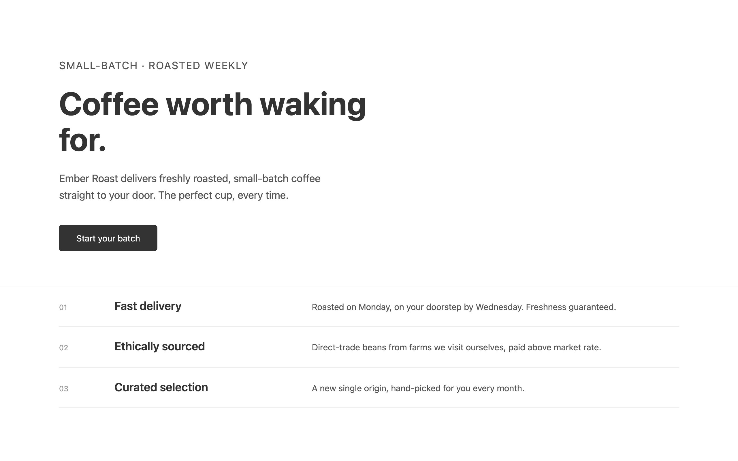
BeforeAfterNotice what the right side is not: it is not five colors in even amounts. It is one dominant color that owns the page and one accent that earns attention precisely because it is scarce. Timid, evenly-balanced palettes are a tell; commitment is a decision.
Lever 3 · Background and depth
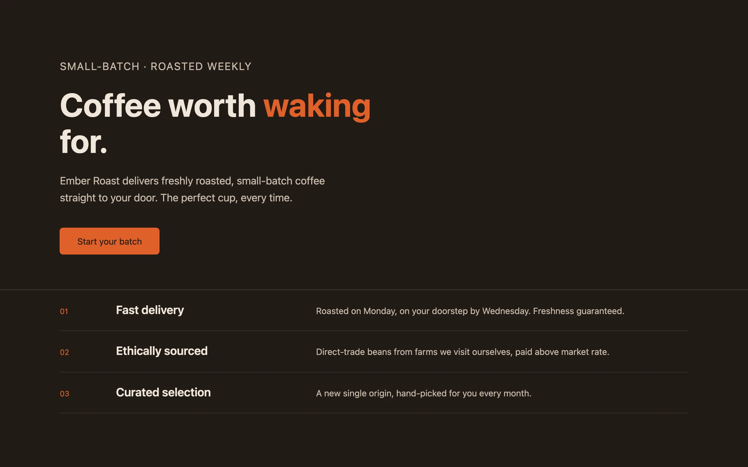
BeforeAfterFlat white behind everything is the void the average page floats in. Depth is cheap: a layered gradient, one geometric motif, a shadow with intent. The right side still has no color and no fancy type — and already looks like somebody's page.
Lever 4 · Motion
The one a screenshot cannot show you. Motion is a real lever — but the way undirected AI uses it (a little fade on everything, hover wiggles everywhere) is itself a tell. The rule you will apply in module 5, when your pages are live in a browser: one orchestrated moment beats ten scattered effects. A page that loads in a deliberate sequence — headline, then support, then actions — feels directed. A page where everything fades in slightly feels generated.
The technique: pull one lever at a time
This is also how you prompt. Asking Claude to "make it more designed" moves all four levers at once, badly. Asking it to move one is precise and reviewable. Open your artifact from the last lesson and run exactly this:
Keep the layout, colors, and content exactly as they are.
Change ONLY the typography: choose a distinctive display face with real
personality for the headline, set it dramatically larger than the body,
and use a monospace face for small labels. Do not touch anything else.You should see
The same page you had, with new type and nothing else. That "nothing else" is the skill — if colors or layout drifted, say "you changed the colors; revert everything except the typography" and it will. You have just done an isolated design revision, which is how the rest of this course works on every page you touch.
What you just learned
- The four levers: typography, color, motion, background — every "designed vs generated" difference lands in one of them.
- Typography: two faces with clear jobs and an extreme scale jump beat one polite face.
- Color: one dominant ground plus one scarce accent beats an evenly-balanced palette.
- Background: layered depth and one motif beat flat white void.
- Motion: one orchestrated sequence beats scattered fades — and "change only X" is how you pull a single lever in a prompt.
practice
Open Claude Cowork on your own computer and try this on real files. Each module ends with a checkpoint where you submit what you made.
Open in ClaudeNext
Name the direction