firstprompt
Anmelden
Alle Kurse

Lehrplan

0 / 39 · 0%
  • Warum alles nach KI aussieht4m
  • Die vier Hebel eines Designs4m
  • Benenne die Richtung4m
  • Kritik mit Designblick4m
  • Modul 1 im Rückblick2m
0/39

Du liest als Gast – dein Fortschritt wird nur auf diesem Gerät gespeichert.

Dashboard/Modul 1/Lektion 1
KostenlosDer Designblick

Warum alles nach KI aussieht

4 Min. Lesezeit·Lektion 1 aus Der Designblick

In the next five minutes you will be able to look at any AI-generated page and name exactly why it looks AI-generated — the vocabulary the whole course runs on.

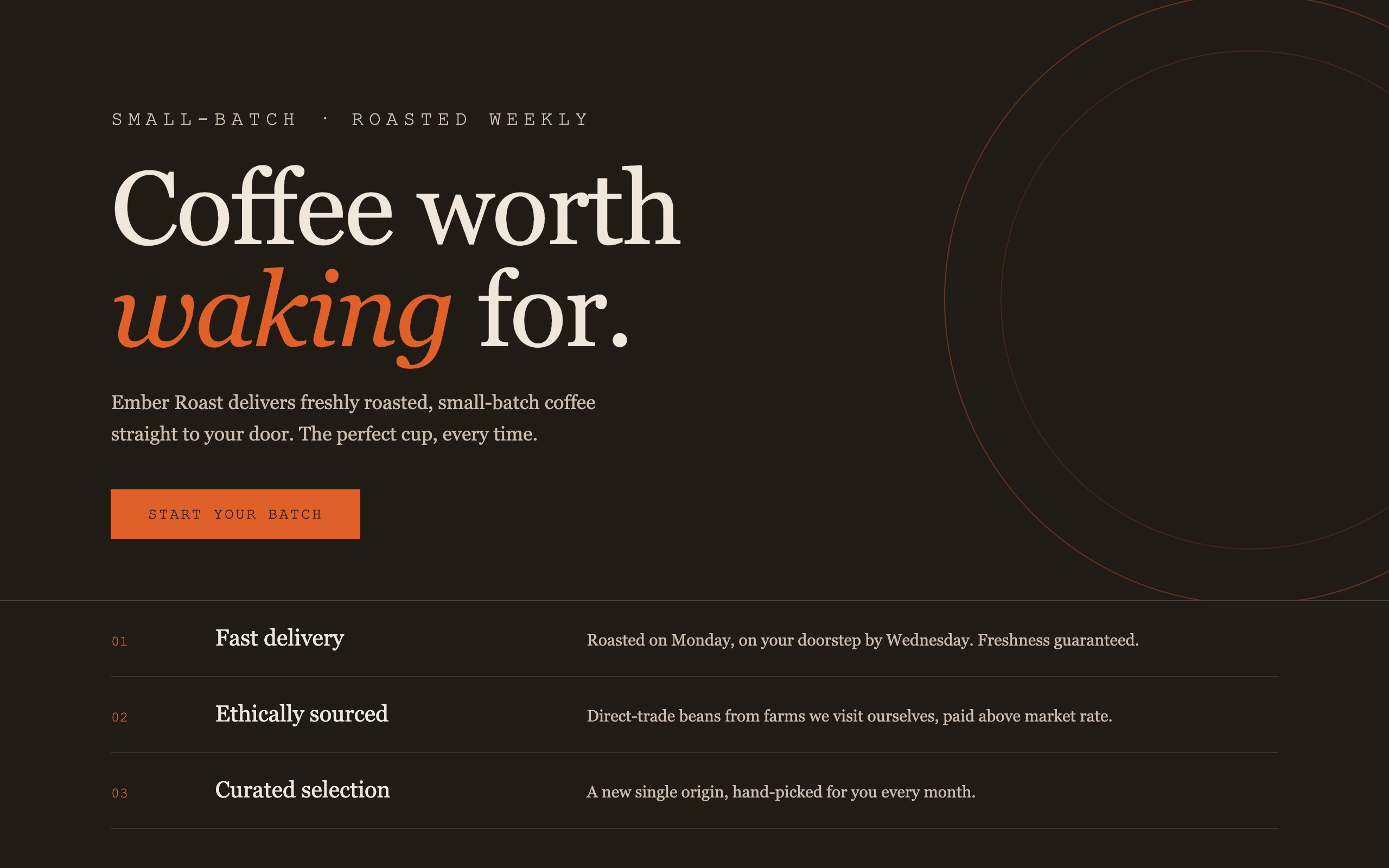
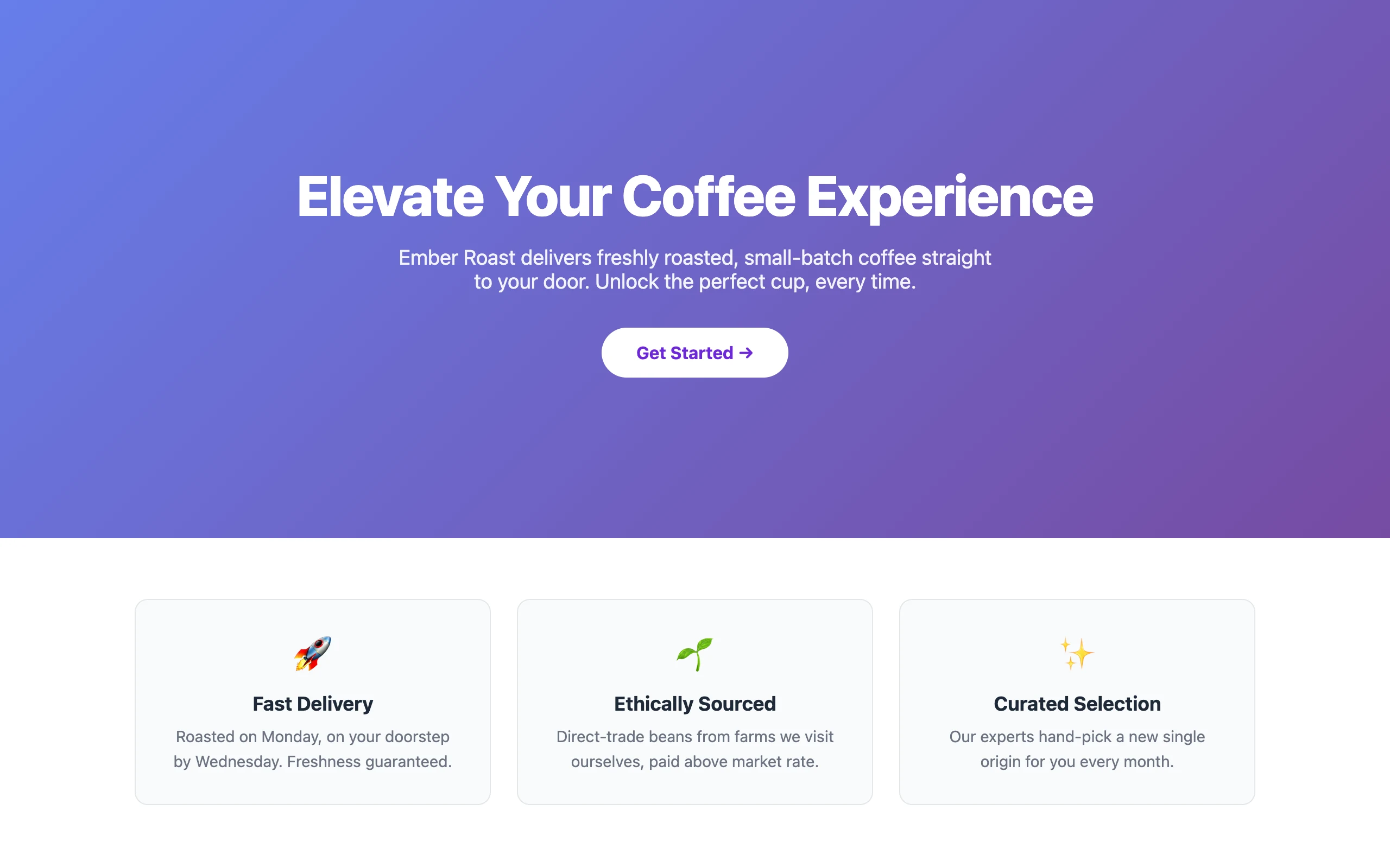
Drag the slider. Same product, same copy, same one-sentence brief. The only difference is one line in the prompt — which is the entire subject of this course.
BeforeAfter
↔
Left: 'make me a landing page for a coffee subscription.' Right: the same request with a direction named. Every other word of the prompt is identical.

The left page is not broken. It is centered, legible, responsive, and completely forgettable. You have seen it a thousand times — and that is the point: you literally have.

Where the sameness comes from

Claude has read millions of web pages. Ask it for "a landing page" with no further direction and it does the statistically safest thing: it reproduces the average of everything it has seen. Anthropic's own engineers have a name for this — distributional convergence — the model converging on the middle of its training distribution.

The middle of that distribution is very specific. Check the left screenshot against this list:

  • A purple-to-blue gradient hero. Nobody chose purple; purple is what "no choice" looks like.
  • System or Inter type, one size scale, no personality anywhere in the letterforms.
  • Everything centered, in a narrow column, with even spacing between identical sections.
  • Three feature cards in a row, each with an emoji where an idea should be.
  • Rounded corners on everything, a soft shadow on everything, an arrow after the button text.

None of these are mistakes. Each one is the most common answer to a question you did not ask. A designer would say the page has no point of view — nothing on it is evidence that anyone made a decision.

The tells are moving

Here is the part most "AI design" advice gets wrong: the slop list above is already the old list. Enough people banned purple gradients that a second generation of defaults appeared. Anthropic's frontend-design skill — the instructions Anthropic itself wrote to fight this, and worth reading in full — names three looks that AI output now clusters into:

Übung

Öffne Claude Cowork auf deinem eigenen Computer und probier das an echten Dateien aus. Jedes Modul endet mit einem Checkpoint, bei dem du einreichst, was du gebaut hast.

In Claude öffnen

Nächste

Die vier Hebel eines Designs

  1. Warm cream, a serif display face, terracotta accents — "tasteful" mode.
  2. Near-black with one acid green or vermilion pop — "edgy" mode.
  3. Newspaper hairlines and dense mono labels — "editorial" mode.

All three are genuinely nicer than the purple gradient. All three are still defaults — a reader who sees five AI-built sites a day now recognises them on sight. The lesson is not "avoid these three palettes". It is: any look you did not choose is a look the model chose for you, and the model makes the same choice for everyone.

See it for yourself

Run the experiment on your own idea. Open claude.ai — the free plan is fine — and ask for exactly this, filling in any product you like:

Create a landing page for [your product idea].

No adjectives, no direction. Let it build the artifact.

You should see

Count the tells from this lesson's two lists. A gradient hero (purple-blue, or cream-and-serif if you caught "tasteful" mode), centered layout, three feature cards, an emoji or a generic icon set, one timid typeface. Three or more tells means you are looking at the distribution's mean — which is what you should expect, because you gave it nothing else to aim at.

Keep that artifact. In the next three lessons you will redirect it — same product, same model — into something with a point of view, and by the end of the module you will be able to say precisely what changed and why it worked.

What you just learned

  • Undirected AI output converges on the average of its training data — Anthropic calls this distributional convergence, and it is why every unprompted page looks the same.
  • The classic tells: purple gradient, Inter/system type, centered column, three cards, emoji icons.
  • The new tells: cream + serif + terracotta, near-black + acid accent, broadsheet hairlines — better-looking, equally default.
  • A design decision you did not make is still a decision — made identically for everyone who typed the same kind of prompt.

Lernfortschritt

0

0 / 39

Lektionen

In diesem Modul

Der Designblick

  1. 1Warum alles nach KI aussieht4m
  2. 2Die vier Hebel eines Designs4m
  3. 3Benenne die Richtung4m
  4. 4Kritik mit Designblick4m
  5. 5Modul 1 im Rückblick2m