Empat tuas sebuah desain
In the next five minutes you will know the four levers that turn a generic page into a designed one — and you will have pulled one of them yourself, on your own artifact.
Anthropic's own guidance for getting better-looking output from Claude — the docs, the cookbook, the frontend-design skill — keeps returning to the same four dimensions. Learn to see them separately and you can diagnose any page in under a minute.
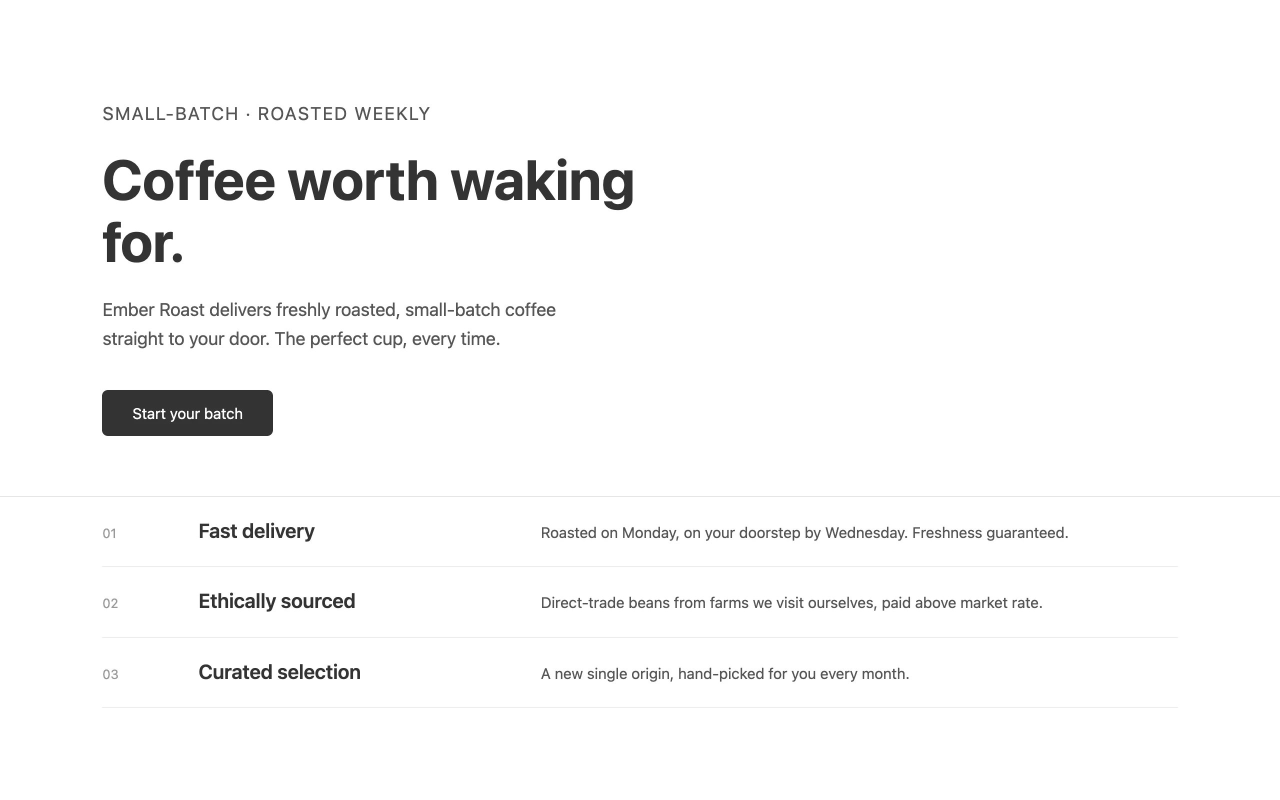
Here is the same flat, competent, undirected page with one lever pulled at a time. Nothing else changes between the two sides of each slider.
Lever 1 · Typography
 BeforeAfter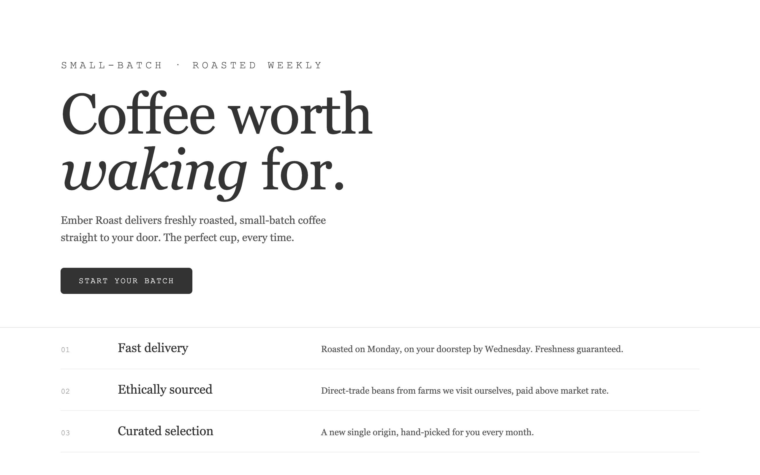
Type is the strongest lever because it is the one readers feel first. The base page uses one typeface at one polite scale — no voice. The right side commits: a display face with personality, an extreme size jump for the headline, a second face (mono) for the small labels. Two faces with clear jobs beat one face doing everything.
Lever 2 · Color
BeforeAfter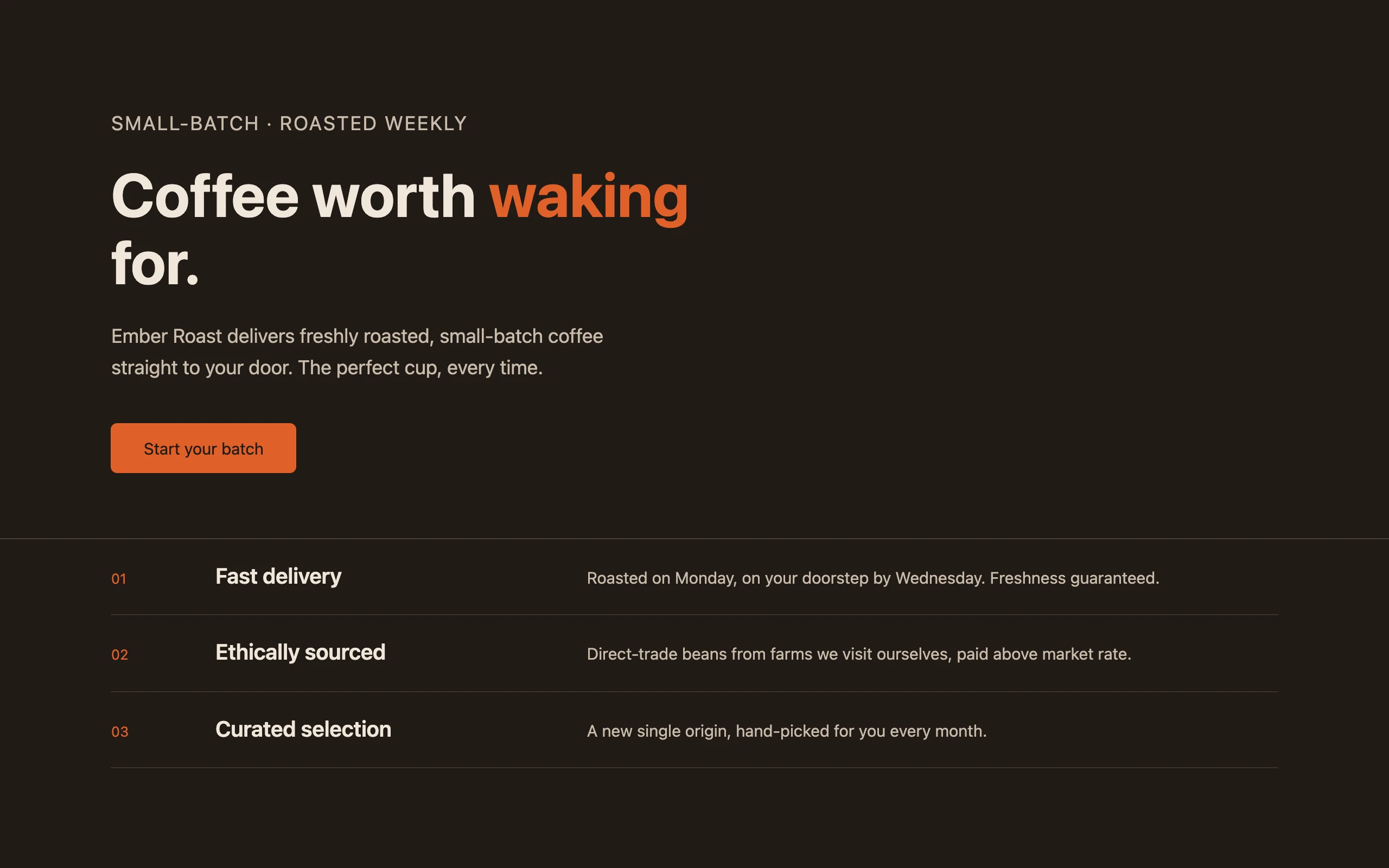
Notice what the right side is not: it is not five colors in even amounts. It is one dominant color that owns the page and one accent that earns attention precisely because it is scarce. Timid, evenly-balanced palettes are a tell; commitment is a decision.
Lever 3 · Background and depth
BeforeAfter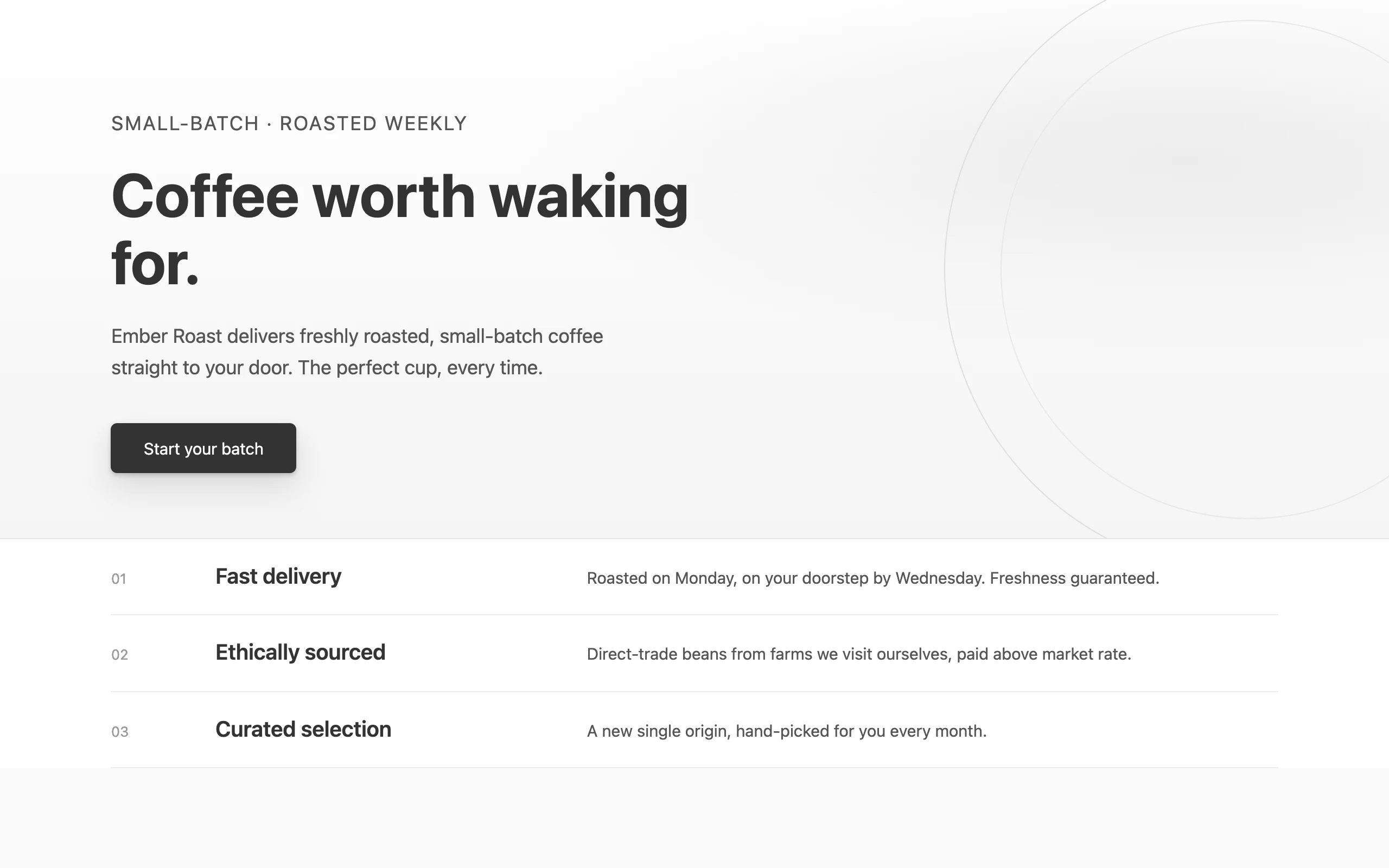
latihan
Buka Claude Cowork di komputermu sendiri dan coba ini pada file sungguhan. Setiap modul diakhiri checkpoint tempat kamu mengirim hasil karyamu.
Buka di ClaudeBerikutnya
Sebutkan arahnya